At least that's what most people think, but I'm here to show you how colorful whate can be.
If white isn't white, then what color is it?
Let's start with a little exercise. Take a look around you.
Do you see an object that is white?
Do you notice any other colors-any highlights or shadows? I hope so!
White acctually reflects colors back to our eye. If the object has any depth, we see multitude of shades and somethimes even different colors depending on what the object is and it's settings.
So, if white is so colorful, how do you know what colors to use when coloring it?
Let's take a look at some simple coloring basics to help answer that question.
When coloring white, there are some basic rules to follow depending on what the object is and its surroundings.
Coloring Subjects with Tones.
If the object is a live subject, it is typically colored in warm tones (Photo1)


If the object is inanimate, iti is typically colored in neutral tones
(photo3)

Translating Coloring With Tones to Your Work
Once you select the right color to represent your white object, the real trick is in knowing how to use it and where to place it.
The traditional light/medium/dark Copic marker blending rule just doesn't work with white.
When coloring white, you most often focus on the coloring shadows.
It's pretty easy when you think of it this way....
pick the appropriate color tone (war, neutral, or cool) and use it to add color to the shadowed areas of the white object. Limit your blending as the image will often look muddy or dirty if you blend too much or if you blend out to pure white.
Don't be afraid to leave crisp shadows. Also don't go overboard; keep colors fairly light and subltle
(photo 4)

While filling the shadows of a white object with color will help portray depth in the image, there is an additional step that you can make your work pop even more.
You've added your colorful shadows and you left the white mid tones, but don't forget about those highlights! At this pint you might be wondering...
How do you highlight white?
Remember that white reflects light, so think about the "color" of the light that is hitting your white object.
If it's bright sunnyday, the light might have a warm yellow tint. If it's dawn or twilight, the light might have a dusky blue, mauve or even pink tint. That is the color that would be reflected back to you in a highlight on white object (photo5)

Again, don't go overboard. A tiny hint of color goes a long way in adding highlights.
Possible Shadow Colors.
Here are just some of the colors that I like to use for adding shadows to white objects. Remember to keep the colro tone(warm/cool/neutral) in mind when picking your colors.
Cool Colors
BG0000
B0000
B60
C00
C1
Warm White
E000
E50
E30
E40
W00
W1
Neutral white N1
By Colleen Schaan
from Card Maker magazine
Coloring and shading basics
1. Begin by stamping your image of choice onto smooth cardstock.
Allow ink to dry completely before coloring image.
2. Once you have stamped your image, choose which colors you might need at hand for easy selection during the coloring process ( photo1)

3. Beginning with the lightest color you plan on using, color the entire area using small circular motions, being sure to fully saturate image will help in blending additional colors as you add them (photo2)

4. Select a similar color in slightly darker shade and begin to add depth by gently touching areas lightly with the tip of the marker. Blend by working with the first color using small circular potions (photo 3 and 4)


5.Select your third color in the darkest shade and add more saturated color to the shadowed or hash-marked areas to increase depth and shadowing. Once again, blend these colors by working with the first color using small circular motions. Note: You can always add more color and repeat steps 4 and 5 until you achieve the desired look. It is better to repeat steps in adding color as it is much harder to remove too much or too dark of color once applied (photos 5 and 6).


6. As with previous three steps, start by coloring leaves with the lightest shade of green. Again, be sure to saturate leavescompletely for the best blending ability (photo7)

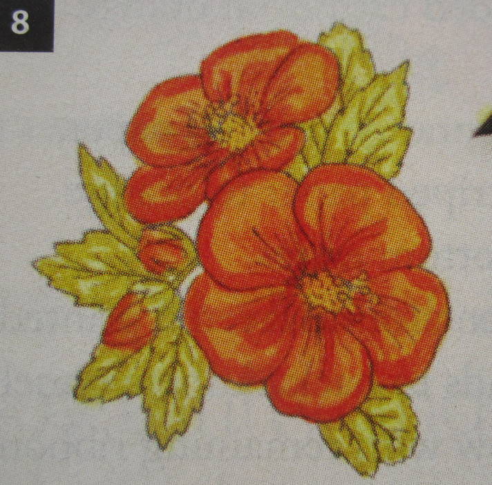

8. As final step in bringing your image to life, add a bit of shading beneath the leaves and to the left of the total image. This gives your final image the grounding it needs to appear as though it is sitting on something rather then just floating in midair. If you find you have gone out of lines in any area, simply "push the color " back into the lines using colorless blender pen.
Start outside the line and press the colorless blenbder tip to the paper and go right up to the outside edge of the line. Repeat until the color is fully removed and your image is how you want it to look. Now, all that is left to do is to use your colored image on a finished project (photo10)

Coloring and Shading Advanced
All of the steps will be the same when using a clear open-line art image; it will be simply be up to you to determine the shading direction and application. A good tip to keep in mind would be to place an imaginary light source shining onto your image and imagine what it would look like if light were hitting from the same direction each time you add depth and shading. And again, remember that you can always add more color to increase the depth of your image, but it is very difficult to remove deep color once applied.
By Keri Lee Sereika
